
· 6 min read
Nikita Shukla

Are you one of those engineers who are just engrossed in academics and is looking to do something more than that in your college days? Rotaract Club of TCET is one of the perfect choices to go for. I f you are searching to participate in something interesting where you can develop yourself and volunteer as well, you are at the correct place. To know more continue reading this blog.

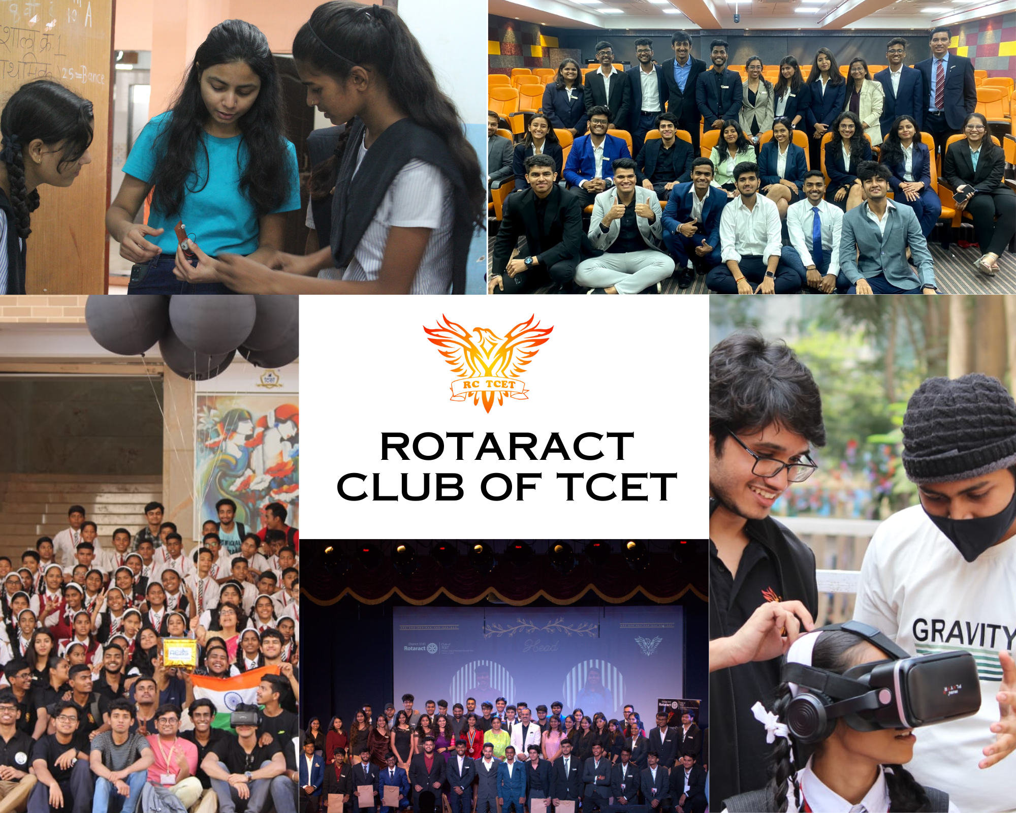
‘Boldly Going: Rotaract Club of TCET '

RCTCET

"The purpose of life is to live it, to taste experience to the utmost, to reach out eagerly and without fear for newer and richer experience."

-Eleanor Roosevelt

Whether you're a musician, artist, athlete, writer, or simply someone who loves trying new things, Rotaract Club of TCET offers a welcoming and inclusive community where you can connect with like-minded individuals and pursue your passions. From workshops and classes to group outings and events, RCTCET provides a variety of opportunities for personal growth, skill development, and social interaction.

Types of Projects & Events conducted in RCTCET

1. Volunteering

Volunteering in community service related projects or events can help you gain practical experience while also contributing to your community.By volunteering, individuals can gain a deeper understanding of community needs and become more empathetic towards others.Community service volunteering activities are a valuable way to give back to the community and make a positive impact on society. They provide individuals with opportunities to engage in meaningful work, develop new skills, build relationships, and gain a sense of personal fulfillment.

Few volunteering events:

  • TechWorld
  • This is a flagship (activities which happens throughout the year) activity where we teach the underprivileged about electronic circuits and create awareness amongst them to pursue Engineering as a career, to mentor younger students for their bright future.
  • Emergency
  • The main aim of conduction of this event is to make our budding Engineers well aware how to perform CPR and give first aid to someone in need.
  • Beach Cleanup
  • Such events are conducted by keeping the welfare of the community and balance of ecosystem in mind. This could be possible only with the contribution of people who are genuinely interested in volunteering. Afterall,"If you concentrate on small, manageable steps you can cross unimaginable distances."

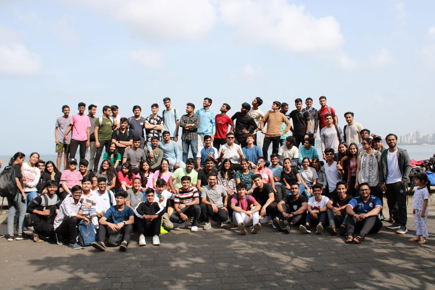
2. Space to Socialize

Joining clubs and organizations is a great way to meet people who share your interests such as sports, music, etc. It is an amazing platform to meet new people and develop bonding. Remember, socializing in college can be challenging at first, but it's important to step out of your comfort zone and take advantage of opportunities to meet new people. Be yourself, have fun, and enjoy the college experience! We have fun Club Service (Avenue) Events which promotes students to know each other irrespective of their branches and to have fun together releasing the academic exhaustion aside.

Examples of such socializing events:

  • Sunday Funday
  • Treasure Hunt
  • Movie Night
  • Badminton Tournament
  • Kick it!(Football Tournament)

3. Space to express creativity

Rotaract Club of TCET provides a cavity to students where they can express their artistic or literary talents. Members can explore different genres of writing, such as poetry, fiction, creative nonfiction, and screenwriting. They can also participate in writing prompts and exercises, which can help them generate new ideas and experiment with different writing styles. Students can showcase their work through public readings and publications. For our members possessing artistic talent, be it in the form of paper or digitalized form of art they can contribute by means of Digital Communication. They can learn, grow and experiment at the same time. For individuals who love to capture beautiful moments they can come forward and give their photography skills a boost. People who are good at branding they are welcomed as well where they can fully utilise their Social Media Marketing skills.

4. Development of Overall Personality

Participating in co-curricular activities can be extremely beneficial for your personal and professional development. Our club can help you learn about the business side of engineering and develop skills such as project management, leadership, and communication. We often organize events such as pitch competitions, guest speakers, and mentorship programs.

We conduct events wherein students learn how to develop Interpersonal Skills, they can participate in group activities, attend workshops and seminars on communication and collaboration, practice active listening, and seek feedback from peers and instructors. Building strong interpersonal skills takes time and effort, but it is a valuable investment for future success.

5. Last but not the least, it is a platform where you can create amazing memories!

RCevent

"Education is not just about academics. It's about building character, improving one's personality, and becoming a better human being."

- Sudha Murty

Joining RCTCET can create can create amazing memories for students. It is a complete new experience where you can participate in different kinds of fun events. Opportunities to travel together, whether it's a weekend camping trip or a day trip to a nearby city the experience is wonderful. Volunteering for a social cause develops a sense of responsibility in young individuals. Competing with your peers gives you confidence to do better than before. Sharing same interests with someone new helps you create memorable experiences. College days are something a student cherishes for life and it is grateful to have a platform as such.

To know more about us:

Visit our Official Website And do follow us @rc_tcet

Conclusion

Remember, co-curricular activities are meant to complement your academic studies. Make sure to balance your time and commitments so that you can excel both academically and personally. Don't be afraid to step out of your comfort zone and try something new. Joining a club as Rotaract Club of TCET can be a rewarding and fun experience that creates memories that last a lifetime. Moreover, social clubs can help promote social cohesion and strengthen community ties. They can offer a sense of belonging and provide a platform for individuals to come together and work towards common goals. In short, Rotaract Club of TCET can be a fun and enriching way to connect with others and build community. By joining this club, individuals can expand their horizons, create new friendships, and contribute to a more vibrant and inclusive society.

· 10 min read
Jayesh Potlabattini

Web designing (the HTML & CSS part, not the Figma Part) can be a real pain if we don’t understand the design system/rules/procedure it uses. Even after watching HTML and CSS tutorials, we can still struggle to design anything in web. But, after having a decent understanding of divisions into rows and columns and learning about display properties and positioning in detail, you we can have some confidence to turn any Figma design to HTML and CSS. This is not a tutorial on HTML & CSS but a comprehensive usage of them. By reading this blog, I hope you can get the confidence and create the Mental Model of Web Design in your Brain

This Blog also serves as a very precise summary of long web design bootcamp I took with **GenosisX Tech Community, watch here**

TL;DR: Create proper rows and columns for each block of design, put them into proper semantic tags or <div> tags. Use display flex or grid on them. Then style them properly with the fonts, colors, paddings, margins, borders, backgrounds. Position them properly with position property of CSS. Use responsive features of flex and grid. Done!

Prerequisite

  • Basic knowledge of HTML and CSS would help, but not necessary.
  • That’s It!

Guide to Divisions

Making proper divisions of design into rows and columns will help you style them better and will make it 100x easier to make them responsive. Let’s get into it.

Visualize Design

Visualize Design #1

Visualize Design #1

  • First think of the separate sections, in this case, there are two, a Header and a Hero section.
  • For every block of divisions, first think of sections as in one row or one column, then multiple columns or rows respectively.
  • Divisions
    • Here, the whole page is one column which has two rows, Navbar and Hero.
    • Then we clearly see, hero is divided into two columns, so hero itself is one row which has two different distinct columns.
    • You can try to dig further deep into each div visually.

So based upon the divisions, we can conclude the following code.

<body> <!-- First Column, whole page -->
<header></header> <!-- First Row, Header -->
<main> <!-- Second Row, Hero section -->
<section></section> <!-- First Column, Main Text Section-->
<section></section> <!-- Second Column, Main Image Section-->
</main>
</body>

Lets dig deep

Visualize Design #2

Visualize Design #2

  • Divisions - Header - a row
    • Img - Logo - First column
    • Navbar - Second column
    • Button - Third column
<body> <!-- First Column, whole page -->
<header><!-- First Row, Header -->
<img src="/.." /> <!-- First column -->
<nav>bunch of <a></a> Tags</nav> <!-- Second column -->
<button>Sign up</button> <!-- Second column -->
</header>
<main> <!-- Second Row, Hero section -->
<section></section> <!-- First Column, Main Text Section-->
<section></section> <!-- Second Column, Main Image Section-->
</main>
</body>

Use semantic tags wherever possible, they hold some meaning and are very important for SEO, read this article to learn more about them. https://www.pluralsight.com/guides/semantic-html

Visualize Design #3

Visualize Design #3

  • Divisions - Main - a row
    • First Column of Hero Section
      • H1 - Main text - First row
      • p - Description text - Second row
      • span - Third Row having two buttons
        • Button - First Column
        • Button - Second Column
    • Second Column of Hero Section
      • img - First Column
<body> <!-- First Column, whole page -->
<header><!-- First Row, Header -->
<img src="/.." /> <!-- First column -->
<nav>bunch of <a></a> Tags</nav> <!-- Second column -->
<button>Sign up</button> <!-- Second column -->
</header>
<main> <!-- Second Row, Hero section -->
<section> <!-- First Column, Main Text Section-->
<h1>Main text...</h1>
<p>Description text...</p>
<span>
<button>Get Started</button>
<button>Order Now</button>
</span>
</section>
<section> <!-- Second Column, Main Image Section-->
<img src="/.." />
</section>
</main>
</body>

Guide to Style them

Pat yourself if you reached till here, and understood everything above! Lets go ahead.

For the next part, I’ll use tailwindcss because it’s easier to explain with. If you know CSS, you basically know tailwindcss. Read this article for a quick introduction, I hope you come back here after reading this. https://tailwindcss.com/docs/utility-first

Step-by-Step Linear Process to Design Anything!

Remember, this is not a hard and fast rule to follow exactly as is. You can add you own flavours to this. Skip steps which are not required. I made this using my personal experience so add modify it if I missed anything.

  1. Write HTML, using the divisions approach
  2. Set background color
  3. Set display - flex (if any child tags)
  4. Set width - compulsory
  5. Set height - optional
  6. set overflow properties
  7. Set font → size, weight, line height, letter spacing,
  8. Set text colors → paddings → borders → margins
    1. Colors - normal, hover, active any states
    2. Borders - width/thickness , color, radius, style
  9. Set position (if want to move the element from its position)
    1. relative - move it from its current position
    2. absolute - move it from its first relative parent start point (top-0, left-0 of relative parent)
    3. fixed - move it from windows start point (top-0, left-0 of whole window)
  10. Set z-index - define stack, which element should be above which
  11. Anything else that suits your design

This is a linear process, which means you first style the first tag then the second tag then the third tag then the next tag then the next tag and so on!

<body> <!-- First style this #1 -->
<header><!-- then this #2 -->
<img src="/.." /> <!-- Then this #3 -->
<nav> <!-- Then this #4 -->
<a>..</a> <!-- Then this #5 -->
<a>..</a> <!-- Then this #6 -->
<a>..</a> <!-- Then this #7 -->
</nav> <!-- and so on till the last tag -->
<button>Sign up</button>
</header>
<main>
<section>
<h1>Main text...</h1>
<p>Description text...</p>
<span>
<button>Get Started</button>
<button>Order Now</button>
</span>
</section>
<section>
<img src="/.." />
</section>
</body>

Here comes the CSS

Web Design Bootcamp Design

Web Design Bootcamp Design

Take a quick look, and we will start with the linear process

Body - main page

We can see that the

  • background color is different
  • width is full screen
  • padding left and right i.e x-axis
<body class="bg-[#f3f3f3] w-[100vw] px-16 " > <!-- First Column, whole page -->
<header ><!-- First Row, Header -->
<img src="/.." /> <!-- First column -->
...

Here,

  • We see, everything is in one row, so set display as flex
  • width is full available space so 100%
  • img - logo
    • width of some pixels
  • navbar
    • width of fit content (automatic)
    • font weight is medium i.e 500
    • Color is gray for all but black for current one
  • button
    • background is orange
    • text is bold
    • longer padding in x-axis, shorted padding in y-axis
    • border radius full rounded
<body class="bg-[#f3f3f3] w-[100vw] px-20 " > <!-- First Column, whole page -->
<header class="flex w-full" ><!-- First Row, Header -->
<img class="w-20" src="/.." /> <!-- First column -->
<nav class="flex w-fit text-[#828282] font-medium" >
<a id="current" class="text-black" >Home</a>
<!-- if id="current" then class="text-black" add this login using javascript -->
<a>How it works</a>
...
</nav> <!-- Second column -->
<button class="bg-[#FF6F1E] w-fit text-white px-4 py-2 rounded-full" >Sign up</button> <!-- Second column -->
</header>
...

We won’t do the whole design, but this will give you enough idea on how we go about designing and how to follow the linear process which may seem overwhelming but is really easy to follow.

Responsiveness, how easy is it?

Desktop First Design Approach

  • First we design the desktop version of our web app
  • Then slowly add rules to make it responsive for tablets then mobile
  • Desktop → Tablet → Mobile
  • This is not recommended

Mobile First Design Approach

  • First we design the mobile version of our web app
  • Then slowly add rules to make it responsive for tablets then desktop
  • Mobile → Tablet → Desktop
  • This is most recommended and used by tailwindcss by default

No media query methods

  • Set max-widths and min-widths
  • Use display flex with flex-wrap, flex-grow, flex-shrink, flex-basis
  • Use display grid with grid-template-columns, repeat - autofit, minmax
  • You can much deeper with maths to avoid media queries but I feel that much is unnecessary.
  • Using some media queries to avoid extreme complexity is always a good idea

A good example of minimum media queries

****The prefix lg: is how we use media queries in tailwindcss, refer this* https://tailwindcss.com/docs/responsive-design

<main class="flex flex-wrap text-lg lg:text-xl m-5 lg:m-10" > <!-- Second Row, Hero section --> 
<section class="max-w-lg" > <!-- First Column, Main Text Section-->
...
</section>
<section class="max-w-lg" > <!-- Second Column, Main Image Section-->
...
</section>
</main>

Get Creative with Positioning

When we want to move some elements from their original position to something else, we use position property.

CSS Positions

  • Static
    • Default value
    • Original position, cannot change it.
  • Relative
    • Set explicitly
    • Can change position from original using properties - top, left, bottom, right
    • Moves towards the specified direction from its current position.
  • Absolute
    • Set explicitly
    • Can change position from original using properties - top, left, bottom, right
    • Move towards the specified direction from the first relative parents start coordinates.
  • Fixed
    • Set explicitly
    • Can change position from original using properties - top, left, bottom, right
    • Move towards the specified direction from the coordinates of window (browser tab) itself
    • Does not move on scroll, stays fixed.

This article by MDN teaches all positionings perfectly. https://developer.mozilla.org/en-US/docs/Web/CSS/position

An example of positioning

Lets look at the image which has blocks of elements floating above it.

Pizza Design

  • So the concept is we wrap the image in one div
  • This div will be set to position: relative
  • This div will contain image tag and other elements of those floating blocks
  • Don’t change image tag position
  • Change position: absolute of all floating elements
  • Then set them to their places via top, left, right, bottom
<section class="relative" > <!-- Second Column, Main Image Section-->
<img class="w-24 h-40" src="/.." />
<div class="absolute top-[30%] right-[-10%]" >...</div>
<div class="absolute top-[50%] left-[-10%]" >...</div>
<div class="absolute bottom-[-15%] right-[12%]" >...</div>
</section>

Conclusion

  • Make proper divisions while writing the whole HTML. Visualize and then create rows and columns.
  • Write whole HTML of one section then style the whole section using the step by step linear process.
  • Position properly and most of it depends on the parents element position property, so make sure you set those correct.
  • Learn flex, grid and positions of CSS very thoroughly.
  • Learn tailwindcss because it will make your life easier, trust me on this.

· 5 min read
Mahima Churi
As technology continues to evolve, web development has become an increasingly important field, and front-end frameworks such as ReactJS have emerged as crucial tools for building dynamic, user-friendly websites. Whether you are just starting out with web development or are looking to enhance your existing skills, I hope that you will find valuable insights and tips within these pages. So sit back, grab a cup of coffee, and join me on our journey through the exciting world of ReactJS!

“Design is not just what it looks like and feels like. Design is how it works.” — Steve Jobs

What is React JS?

React JS is nothing but a java script library that helps the developers in creating reusable UI components there by increasing the efficiency of code. When making dynamic websites React JS is proven to be more effective than Vanilla JS, and hence it has become a popular choice for building fast and scalable single-page applications. In simple terms, ReactJS helps make web development more efficient, organized, and dynamic.

Characteristic Features of React JS that makes it more versatile and Popular

Features of ReactJS
Features of ReactJS

1. Virtual DOM

In traditional web development, when changes are made to a web page, the entire page needs to be re-rendered, which can be slow and time-consuming. The Virtual DOM solves this issue by creating a virtual representation of the web page in memory so when changes are made, ReactJS updates the virtual DOM instead of the actual page, which is much faster. Then, ReactJS compares the virtual DOM to the actual page and updates only the parts that have changed, rather than the entire page. This makes the updates and rendering process much faster and more efficient, improving the overall user experience of the web application.

2. Reusable Components

ReactJS uses a component-based architecture, which means that the user interface is built using reusable components. Each component is a self-contained unit that handles a specific task or displays a specific piece of information, we can say that each components are independent. This makes the code more organized and easier to maintain, as well as reducing the amount of redundant code.

3. Community

React has a vast and supportive community of developers who are constantly contributing new features and tools. React is open-source, meaning that anyone can contribute to the development of the library by fixing bugs, adding new features, or improving existing ones.

Link to contribute to the React Library

4. JSX

JSX stands for JavaScript XML. It is a syntax extension for JavaScript used by ReactJS that allows developers to write HTML-like code within their JavaScript. This makes it easier for users to write and understand the code, as it closely resembles the structure of HTML. This helps to improve the overall development experience by making the code more intuitive and easier to read.

For example, instead of writing the following code in pure JavaScript to render a simple button:

React.createElement("button", {className: "myButton"}, "Click Me!");

The same code can be written in JSX as:

<button className="myButton">Click Me!</button>; 

5. Server-side Rendering

Server-side rendering (SSR) is the process of rendering a web page on the server before sending it to the browser. In the case of React, this means that the React components can be rendered on the server, allowing the browser to receive a fully rendered HTML page, instead of having to wait for JavaScript to execute and render the page on the client side again and again.

This results in faster initial load times, as the browser doesn’t have to wait for the JavaScript to execute and render the page. Additionally, server-side rendering can improve Search Engine Optimization (SEO), as search engines can better index and understand the content of the page.

6. Compatibility

React’s simplicity and straightforward design makes it easy for developers to learn and adopt and it works seamlessly with other libraries and frameworks, such as Redux, allowing developers to create complex and scalable web applications.

Comaprison with other Frontend Frameworks

Popular Web Frameworks
Comparison with other frameworks as per the recent survey

Source: Stack Overflow Developer Survey 2021

From the above survey it can be clearly seen that React JS was named as one on the most commonly used web Framework.

React’s virtual DOM provides fast updates and rendering compared to traditional DOM manipulation. Angular and Vue also have optimized updates, but they may not be as fast as React’s virtual DOM.

Also, React is known for its simplicity and minimalistic approach, making it relatively easy to learn and get started with. Angular, on the other hand, has a steeper learning curve due to its more complex architecture. Vue falls somewhere in between, offering a more accessible learning experience as compared to Angular.

info

You can see more detailed insights of React JS on their Official Website

Conclusion

In conclusion, React is the future of web development, offering a robust set of features and tools that make it easy to build high-performing, scalable, and maintainable web applications. Its simplicity, performance, and compatibility with other technologies make it an excellent choice for modern web development.